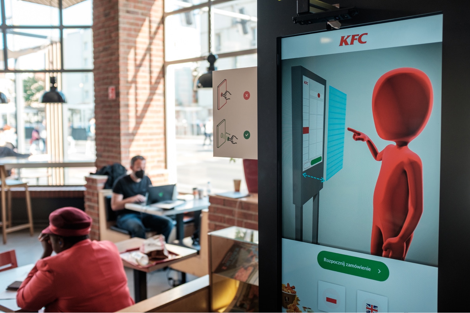
A major challenge was designing an interface that was intuitive for users, as hungry customers are not keen on learning new interaction patterns.
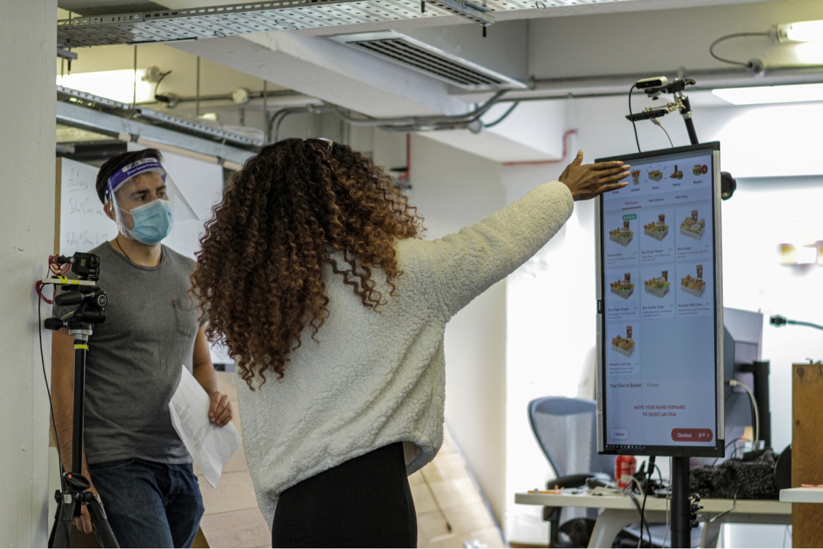
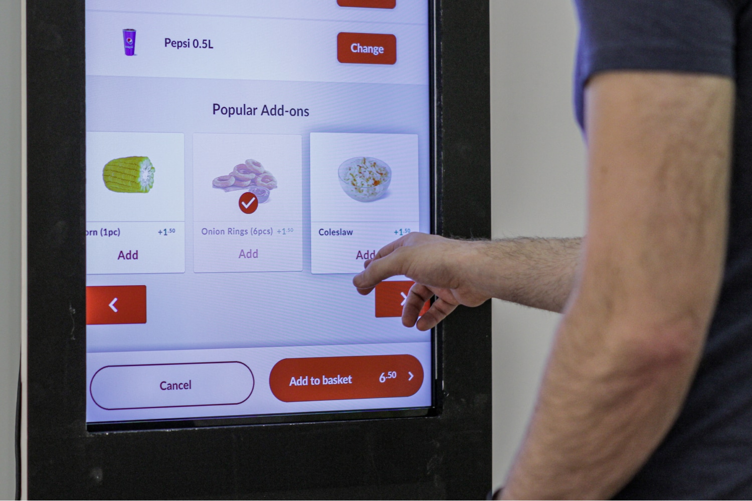
I led the front-end prototype efforts, interaction design, and hardware development for the kiosk. A major challenge was designing an interface that was intuitive for users, as hungry customers are not keen on learning new interaction patterns. To create an effortless experience, we explored gestures that allowed users to explore menus, select and customize items, and finalize their orders. To avoid the need for a cursor, we used a proximity-based model that felt similar to a touch screen without requiring physical contact with the screen.
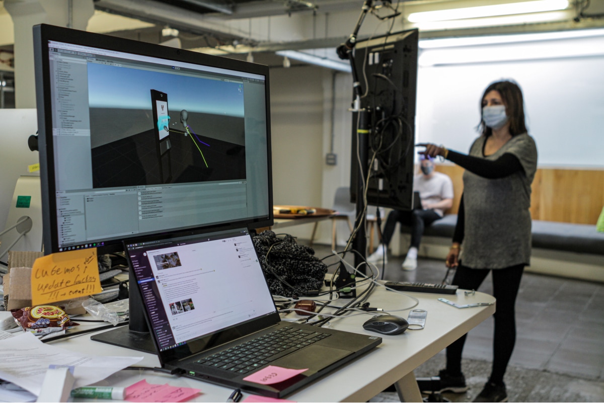
Testing out in the wild
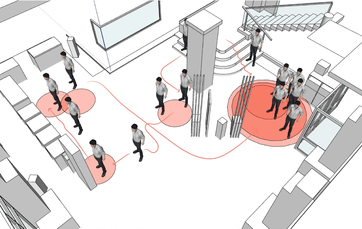
Due to travel restrictions during the pandemic, we used 3D scanning and virtual reality to model user behavior and determine the best placement for the kiosk and other touchpoints in the restaurant. We also integrated the prototype with the restaurant's content management system (CMS) and point-of-sale (POS) system, ensuring that the menu displayed on the kiosk was always up to date and orders could be placed in real time.
